Is Civ 7's UI as Bad as They Say?
Is Civilization VII's UI Really That Bad? A Critical Assessment

Civilization VII's Deluxe Edition launched recently, and online discussions are rife with criticism of its user interface (UI) and other perceived shortcomings. But is the negativity justified? Let's delve into the game's UI, examining its strengths and weaknesses to determine if the online consensus is accurate.
← Return to Sid Meier's Civilization VII main article
Assessing Civ 7's UI: A Detailed Look
Early impressions of Civ VII, especially its UI, have been mixed. While it's easy to join the chorus of criticism, a more objective evaluation is necessary. We'll dissect the UI element by element, comparing it to the hallmarks of effective 4X game interfaces.
Defining a Superior 4X UI
While some argue for objective 4X UI design standards, the reality is more complex. A UI's effectiveness depends heavily on the game's style, goals, and context. However, common elements consistently appear in highly-rated 4X UIs. Let's use these benchmarks to evaluate Civ VII.
Prioritizing Information: The Hierarchy of Data
A good 4X UI prioritizes essential gameplay information. Frequently used resources and mechanics should be readily visible, while less crucial elements should be easily accessible. The UI shouldn't overwhelm the player with excessive detail.
Against the Storm provides a strong example. Its building info menus, accessed via right-click, use tabs to organize information by frequency of use. Essential actions are prominent, while less common functions are tucked away in separate tabs.
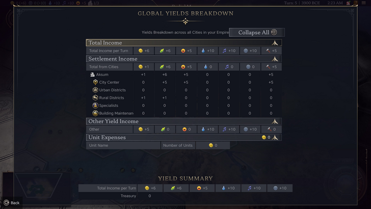
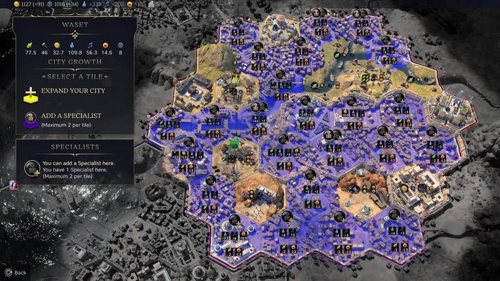
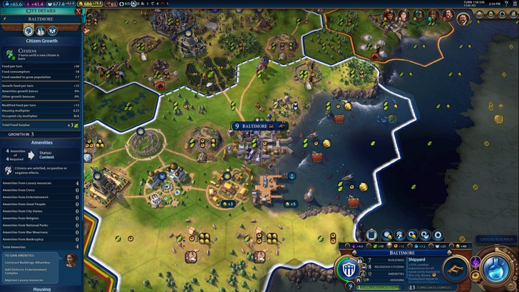
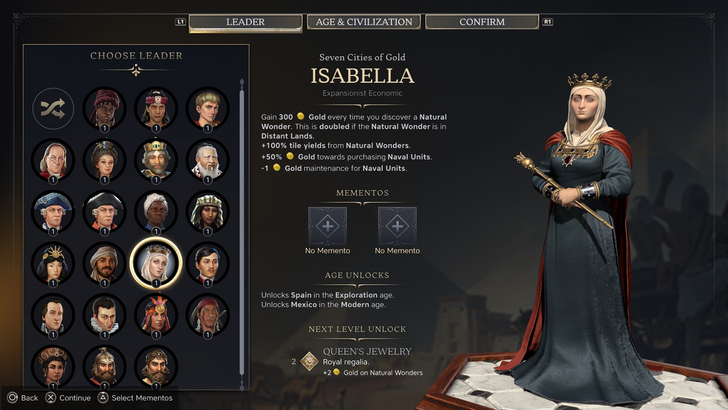
Civ VII's resource summary screen displays resource allocation, neatly categorized by income, yields, and expenses. While the layout is functional, it lacks granular detail. For instance, it shows overall resource production from rural districts but doesn't specify which districts or hexes contribute. The expense breakdown is also limited. The UI functions adequately but could benefit from increased specificity.
Clear Visual Communication
Effective visual indicators—icons, colors, and overlays—convey information quickly and intuitively. A well-designed UI minimizes the need for extensive text or numerical data.
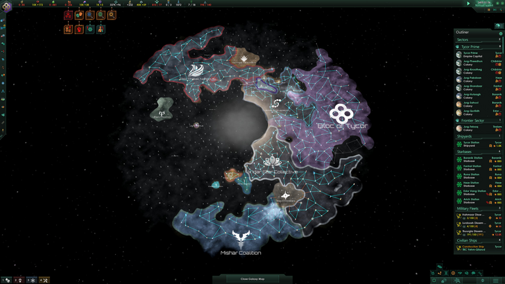
Stellaris, despite its cluttered UI, uses visual indicators effectively in its Outliner. Icons instantly communicate the status of survey ships and colony needs.
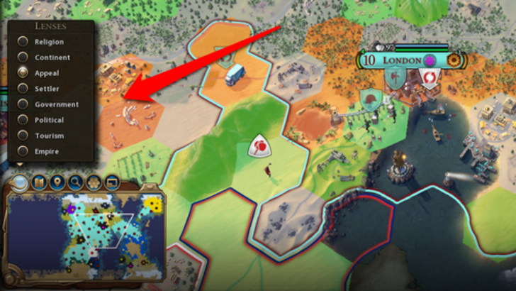
Civ VII utilizes iconography and numerical data. The tile yield overlay, settlement overlay, and settlement expansion screen are visually informative. However, the absence of certain lenses present in Civ VI (e.g., appeal, tourism, loyalty) and customizable map pins has been criticized. While not disastrous, there's room for enhancement.
Search, Filtering, and Sorting
As complexity increases, search, filtering, and sorting become crucial. These features allow players to manage information effectively.
Civ VI's powerful search function allows players to locate resources, units, and features on the map. Its Civilopedia seamlessly links entries to in-game elements.
Civ VII lacks this crucial search functionality, a significant drawback given the game's scale. This omission significantly impacts usability. Hopefully, Firaxis will address this in future updates.
Design and Visual Coherence
A UI's aesthetic quality and consistency are paramount. A poorly designed UI can detract from the overall gaming experience.
Civ VI's vibrant, cartographic style enhances the game's aesthetic appeal. Its cohesive design reinforces the game's identity.
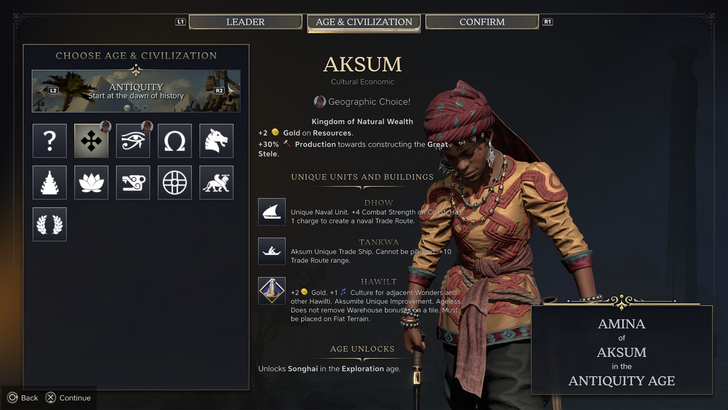
Civ VII adopts a minimalist, sleek design. While not visually unappealing, its more subtle thematic approach has received mixed reactions. The design is subjective, but the lack of immediate clarity is a valid criticism.
The Verdict: Not as Bad as Advertised
Civ VII's UI, while not perfect, doesn't deserve the level of condemnation it has received. The absence of a search function is a significant flaw, but not game-breaking. Compared to other issues, the UI's shortcomings are relatively minor. While it pales in comparison to some more visually striking and efficient 4X UIs, it possesses strengths. With updates and player feedback, it can improve significantly. The current state, however, is not as dire as some claim.
← Return to Sid Meier's Civilization VII main article
Sid Meier's Civilization VII Similar Games


![Roblox Forsaken Characters Tier List [UPDATED] (2025)](https://img.actcv.com/uploads/18/17380116246797f3e8a8a39.jpg)


- 1 Silent Hill 2 Remake Confirms Xbox, Switch Release in 2025 Feb 08,2025
- 2 Connect Asus ROG Ally to TV or Monitor: Easy Guide Apr 06,2025
- 3 Fix 'Can't Connect to Host' Error in Ready or Not: Quick Solutions Jun 13,2025
- 4 The Best Free Comic Book Sites and Apps in 2025 Mar 18,2025
- 5 Dragon Soul Tier List: Ultimate Guide May 12,2025
- 6 "Persona Games and Spin-Offs: Complete Chronological List" Apr 09,2025
- 7 How to Run JioHotstar on PC with BlueStacks Feb 28,2025
- 8 Assassin's Creed Shadows: Max Level and Rank Cap Revealed Mar 27,2025


-
Top Arcade Classics and New Hits
A total of 10
-
Addictive Arcade Games for Mobile
A total of 10
-
Android Apps for Video Content Creation
A total of 10